parametric-marks-need-render-testing
Summary
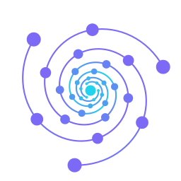
Section titled “Summary”This session designed a new logo for vir—an LLM wiki tool for Obsidian—replacing an 18KB bloated whirlpool mark with a parametrically generated graph spiral. The most important insight was that marks should be built by parametric script (solving for exact canvas coverage) and rendered at multiple sizes and backgrounds before committing, since visual flaws (core clutter, rim disappearing under downscale) only surfaced in the render, not on paper.
What Was Learned
Section titled “What Was Learned”-
Value inversion beats darkening for background-agnostic marks. The first vortex version darkened toward the core (reads as depth), but disappeared on dark backgrounds and looked like ugly blobs on white. Inverting to bright at the core fixed both without sacrificing the depth cue. Perceptual design requires testing across backgrounds.
-
Parametric generation + multi-size render catches what sketches miss. Writing Python to build the SVG (not hand-drawing it) meant: (a) every parameter ramped monotonically (opacity, radius, rotation, color), so depth read cleanly; (b) canvas coverage was exact by construction (spiral radius solved to reach canvas edge); (c) testing at 16/32/64/140/180px on light and dark backgrounds exposed real flaws (rim vanishing under 32px, core mashing into cyan blob at full extent).
-
Concept should mirror the product. The graph-spiral (nodes spiralling into a core) is better than abstract vortex patterns because it is what vir does—scattered graph nodes pulled into order. It also visually echoes the Obsidian graph screenshot in the README, creating narrative reinforcement.
-
Node size falloff matters more than spiral tightness. When the spiral read as an asterisk (too few turns) and then as mush at the core (arms too deep), the fixes were: (1) add turns until it fills the canvas; (2) use superlinear falloff (t^1.4 instead of linear) on node radius so the inward acceleration feels real. The geometry creates the reading, not the decoration.
-
Node-based marks have an inherent downscaling ceiling. Both the vortex arcs and graph spiral collapse below 32px because the fundamental visual elements (thin strokes, small dots) can’t survive that size. This isn’t a failure to optimize—it’s the concept’s limit. The current whirlpool has the same problem. True favicon needs a separate reduced glyph (fewer arms, just the core dot).
Context
Section titled “Context”Logo redesign was driven by recognizing the existing mark was bloated (18KB of inline styles) and didn’t convey the product’s core idea (knowledge distilled into order). The session validated that iteration is fastest when the mark is code, not art—parametric SVG generation + render testing at realistic sizes beats multiple hand-drawn mockups.
Related
Section titled “Related”- measurement-overturns-retrieval-defaults
- model-judge-human-mismatch
- audit-first multi-phase delivery
- test-isolation-leak
- backdrop-image-as-negative-space